Skolar Sans is an extensive type family for the age of responsive design. The whole type system consists of 72 fonts, uprights and italics in four subtly graded width variants and nine weights.
Visit the Skolar Sans microsite »
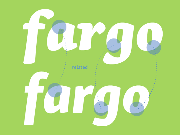
Very early on in the development of Skolar (originally conceived as a typeface for academic publishing), I knew it would need a sans serif counterpart in order to truly cover the needs of scholarly publications. It took several years to get to it and several more to finish. Along the way it has become the largest project Rosetta has tackled so far. It is important to note that it is a collaborative effort between Sláva Jevčinová (Slovakia) and myself. Also Rafael Saraiva (Brazil) helped a lot during his internship with Rosetta.
Skeletons and other costume ideas
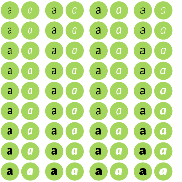
It is easy to say: “let’s design a sans to match the serif!”, but what does it actually mean? Let me try to answer that, at least theoretically. Clearly, one cannot simply chop off the serifs and hope that the outcome would be a decent sans. Sans serifs form a type genre of their own right! Type designers often use the idea of a shared skeleton to illustrate the translation from one to another. The skeleton is supposed to ensure that resulting typefaces are allied. In other words: the bones are the same but the muscles are different. This is a very compelling direction that we followed ourselves to a certain extent, but it has at least two issues.
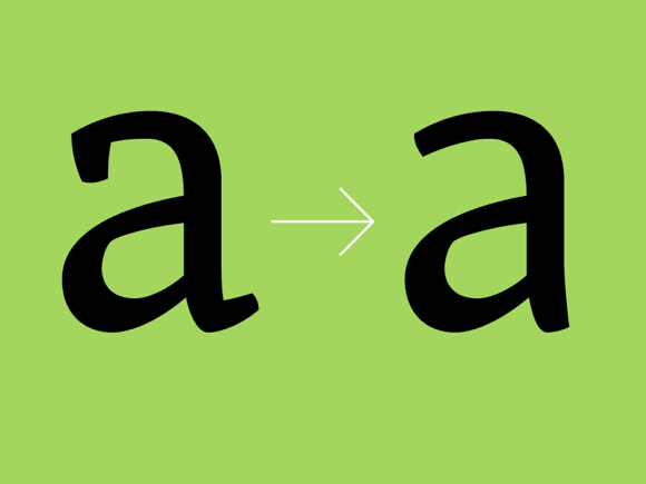
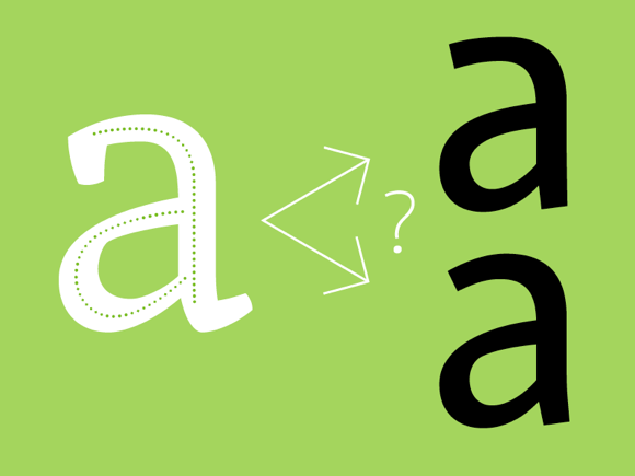
Firstly, the skeleton does not give any indication about the style, contrast, or modulation (in fact it is abstracting exactly that). It makes sure the construction is similar, but how does one make sure the sans and the serif are coordinated stylistically despite belonging to two different genres? Secondly, it is the notion of harmonisation that is odd. What is the goal? Is it a sans mimicking the serif to ‘look as much as it as possible’ or perhaps something more?
Making progress
Our answer to the first issue lies in recognising the fact that serif and sans serif typefaces express themselves in different ways. Seriffed typefaces have terminals (actual serifs included) and/or a pronounced contrast between thick and thin strokes. Sans serifs, on the other hand, have limited options as they, obviously, do not have the actual serifs’ terminals and the contrast between thick and thin strokes is often reduced to a minimum. Simply put, less material to play with. Their power, however, lies in the sheer palette of styles and relationships between them. Thanks to their simplified letterforms, sans serifs can span from very thin to very bold, from narrow to wide. It is in this progression where the styling of conventional monolinear sans serifs has extensive possibilities. In the way the proportions and contrast mature from a showy thin style to a humble regular and unfold from there to the shouting heavy weights.
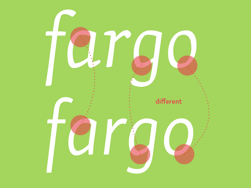
In order to design a versatile sans, we had to tone down the styling. It simply would look too jolly and eccentric if we repeated everything that happens in Skolar’s seriffed contours. A bit of that was brought back in the way the weight progresses towards the bold styles. You can clearly see Skolar’s fingerprints there, yet they are much more subtle in the regular styles. The italics are perhaps even more explicit. The bold styles sport the broken contours of Skolar’s italics, while this feature does not come into play in the regular styles where it would have been distracting. Admittedly, this was not an easy task, and we had to redraw the typeface repeatedly to get it right. And just between us, it is not a good idea to change your mind when you are designing 72 fonts at once! The result is modest where appropriate and stylish where possible.
A companion with a mind of its own
We did not want to design a lookalike sans for the serif, a clone. Instead of having a combo which looks great together we wanted a team that plays well together in order to solve design challenges. Therefore we aimed to design Skolar Sans as an independent companion to complement the serif in situations which are better served by a sans. Therefore whenever we had to decide if to follow Skolar’s path or have a well-working sans, we opted for the latter. The ultimate goal was to create a sans / serif type system that would work well in complex book typography and would be versatile enough for editorial and corporate environments. Three areas where Skolar is typically employed nowadays.
72 fonts, was that really necessary?
Perhaps we just got carried away, but let me elaborate a little. There are four different width variants: Compressed, Condensed, Normal, and Extended. The Normal variant was designed to fit the serif. However, it is noticeably narrower, which brings a change of rhythm that helps to distinguish between the sans and the serif in continuous text. But what if someone wants something a little wider than that? This is where the Extended variant derives its raison d’être. At first we designed it much wider, but it seemed pretty useless (I am still waiting for someone to show me why wide styles are actually useful). So the current Extended is just a tiny bit wider than Normal and will work best in logo design or on screen in small sizes. The Compressed and Condensed variants come in handy for narrow paragraphs, captions, and anywhere where the economic department has a stronger voice than the copywriters. But if no one finds them useful we promise to delete them.
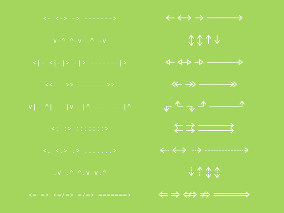
Arrows &c.
Here is a confession, we do love arrows, so the sans had to include them. And to Sláva it seemed, that the Compressed variant should have them compressed and the Extended should have them extended. That makes for a pretty wide selection of arrows. And they are easy to combine.
And needless to say, there are alternative forms, ligatures, small caps, multiple figure styles, fractions, superiors, inferiors, case-sensitive punctuation, and whatnot. Simply everything you might need to fine tune your text setting.

Here they are
To conclude and to leave our dear reader with a nice analogy, think of Skolar Sans as a companion rather than a descendant. Not like Dick Grayson to Bruce Wayne but maybe John Watson to Sherlock Holmes. A versatile partner who can accommodate for an opinionated compadre, but does more than just follow his footsteps. Equally peculiar but nonetheless a gentleman. We hope you will use their services in the years to come.
Magnifying glass sold separately.
See the Skolar Sans microsite for more details.
Introductory discount & free fonts
We offer an introductory 30 % discount on all the fonts or bundles until 9 December. Furthermore Regular and Italic fonts are offered for free (within the limits of our licence).
Thanks
Big thanks to Florian Runge, Anna Giedryś, and William Montrose for their help with the visuals, photo editing, and copy editing, respectively.