To accompany our upcoming release, Avory by Sláva Jevčinová, we asked art historian Lucie Urbánková to write a brief introduction about Jaroslav Benda whose typographic work served as a starting point for the creation of the typeface. The internationally lesser known Czech designer-explorer was born in the Austrian-Hungarian Empire, lived through both World Wars, and embraced stylistic change with enthusiasm and vigour.
Jaroslav Benda influenced numerous areas of the fine arts in the first half of the twentieth century. Showing impressive versatility, his work spans from monumental decorative works, mosaics, etched glass, typography, and posters, to precious metal objects. He is best known though for his book designs, book covers, lettering, and typeface design. His work with leading publishers contributed to the foundations of the modern Czech book style.
Benda’s graphics and book typography cover a broad range of expressions, often following prevailing art trends or demands of publishing houses. However, there are principles common to all of his work: a professional exactitude, connecting his understanding of an overall concept with interesting artistic and typographic solutions, and his original use of typefaces.
Book design and stylistic twists
In the first decade of the 20th century, Jaroslav Benda and several other artists stood at the beginning of a revival in the artistic quality of Czech books. He did not view books as a rarity or custom-made, stand-alone opuses. Rather, he relied on conventional printing presses and remained faithful to the original purpose of the book, which is to disseminate knowledge.
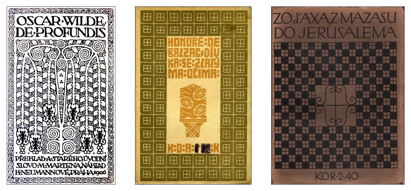
Aesthetically, the early work of Benda was strongly influenced by the Arts and Crafts movement and the ideas of William Morris. This movement later led Benda to his art nouveau period. The indulgence in floral and geometric ornament so typical for this style, echoed even in his later, cubist designs, typically based on a geometrical arrangement of grid patterns and fractured lines. The establishment of the Wiener Werkstätte (Vienna’s Workshops), Bauhaus in Germany, and a similar art group Artěl in Czechoslovakia brought up a gradual shift to modernism in Czechoslovakia and by extension in Benda’s work. He was a founding member of Artěl for which he also designed the logo and stationery.
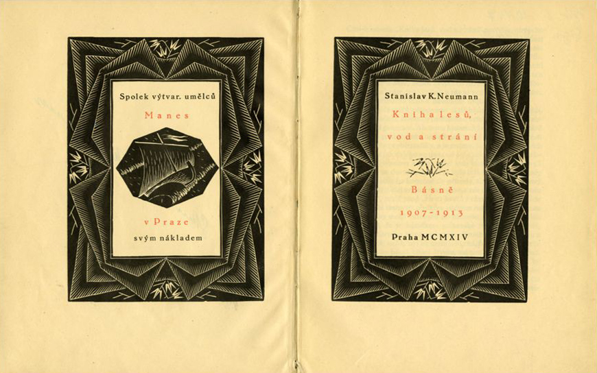
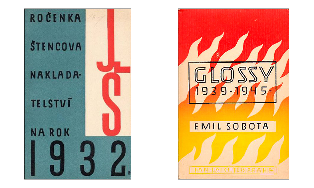
His simple linear, sometimes ornamental work stood opposite to the book designs spearheaded by contemporary avant-garde artists, like Josef Čapek, who either used new means of expression (e.g., collage, montage) or designed individualised covers and bindings. In contrast, Benda’s work can appear conservative, repeating the same elements over and over again. Yet, in the late 1920s and early 1930s, following another stylistic change, Benda created several book covers that were inspired by constructivist typography. He embraced alignment grids, asymmetrical composition, as well as dramatic diagonal arrangements. However, his book cover design work truly peaked in the 1940s and 1950s when he replaced conventional woodcut illustrations with distinctive, idiosyncratic lettering, calligraphy, and colour gradients.
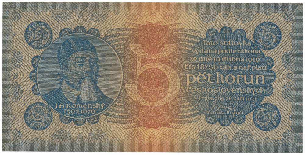
Over the course of his career, Benda also focused on other branches of the applied arts that were closely related to the visual language of the newly-established Czechoslovakia. These included designs for stamps, banknotes, tapestries, cut glass. In the late 1930s, fascinated by the new opportunities, he also contributed to the very beginnings of Czech animated film.
Typeface design
In the 1930s, Benda attempted to develop his first, “typically Czech” typeface. He sent his drawings to the Monotype Corporation for casting, but the design never made it into production.1 As Benda believed the drawings had been destroyed, he continued revising his own version until the 1960s. In 1962, at the age of 80, he and his daughter Jarka Tupá published Betu (Benda-Tupá), an evolutionary conclusion of the designs supplied to Monotype.
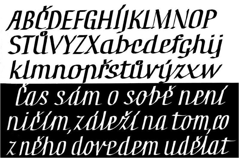
Following is David Březina’s analysis of the version Benda sent to Monotype.
The typeface is a rather strange collage of unconventional elements and stroke treatments. It is hard not to be judgemental at first, but there is a lot to discover if one resists such temptation. The bars in ‘a, e, f, t’ are surprisingly dark; the stroke contrast seems unresolved and inconsistent; leaf-like terminals that reference art nouveau aesthetics contrast with sharp serifs in unexpected combinations. The diagonals in letters like ‘k, v, w, y’ are connected with a bar, a signature trick of many of Benda’s letterings. The individual letterforms further add to the the frenzied collection of shapes: the bowl of ‘a’ is angular, the ‘b’ is spurless, ‘l’ has a tail-like out-stroke similar to the one in ‘t’ instead of a typical bottom serif, ‘y’ has a vertical descender, the bottom of ‘z’ is lifted above baseline in order to engage in an impatient swashiness. The letter ‘s’ looks unfinished. It must be an awkward early attempt because the ‘§, &’ – much more challenging letterforms – are executed with confidence. Or were they possibly added by someone else? The figures, on the other hand, radically refuse any attempt at coherent treatment. A coherence-sensitive reader might prefer to look the other way.
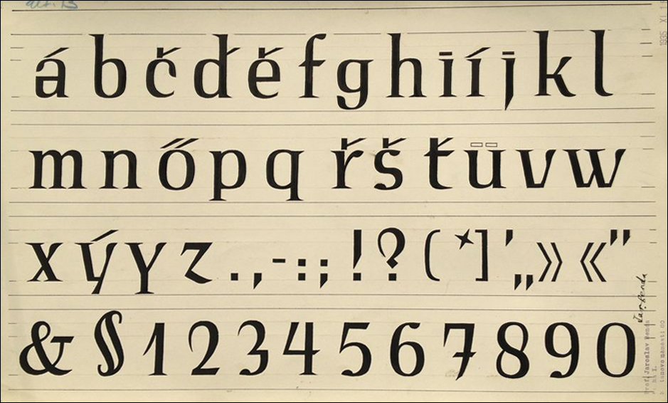
The diacritical marks are a remarkable representative of a blind evolutionary branch of accent design, yet they make for an interesting study. Benda clearly tries to establish a system that associates carons with acutes. This allows him to resolve the placement of caron on letters with ascenders such as ‘ď, ť’ where the vertical part of the caron merges with the ascender (today this is solved by adding a vertical stroke or a teardrop accent next to the ascender). Dot accents are merely flat rectangles which makes them a bit feeble. The inclusion of the Hungarian double acute and german umlaut (dieresis) is a statement of its own. Perhaps Benda, being born in the Austrian-Hungarian empire, could not not include them.
Although this version of Benda’s typeface might cause a headache for many of today’s type designers, it also presents a wealth of striking ideas. Three beasts in one skin, each pulling in a different direction. We are bound to see more, new typefaces inspired by this work soon.
Conclusion
Benda’s book designs and typography can be viewed from two different angles. On one hand, there is a tendency to conform to ideals of a certain period, and along with that, publishers’ demands, on the other is his loyalty to usefulness and simplicity, and an emphasis on typography. In addition to his body of work, on which he actively worked up until his final years, there is also the sheer quantity of his professional texts and essays. Some of them were published as books during his lifetime, while others remain in archives. Either way, they remain an impressive account of his creative spirit.
This year marks the 135th anniversary of Jaroslav Benda’s birth, yet a complete study of his work is sorely missing. A monograph providing a concentrated overview of his life’s work in typography is currently in the making. The authors Lucie Urbánková and Petra Dočekalová will introduce the publication “Jaroslav Benda 1882–1970” at the exhibition of the same name, which will open on 6 June, 2017 at the UM gallery of the School of Applied Arts in Prague.
—
Footnotes
1. These drawings were considered lost, until recently recovered thanks to the help of Dan Rhatigan, type director at Monotype Inc. at that time.