Last year in January we started Rosetta Type Foundry with the hope of improving support for some of the world scripts and to release high-quality multi-script typefaces. It seems appropriate to look back after this first and busy year, sum it up, and perhaps hint at what is coming next.
Besides the two TypeTogether multi-script typefaces (Maiola and Skolar) initially included in our library, we managed to release four retail families and one custom. One should be aware of the fact that multi-script type families take considerably more time to finish. It takes a lot of patience and I have the utmost respect for our designers for producing such refined work. Thanks to them, our font library already supports five scripts — Latin, Cyrillic, Greek, Arabic, Armenian — and in all 141 languages directly and about 30 through transliterations.
Most of our released typefaces received awards from established international type competitions with specialist jury in world scripts. Those competitions include ATypI’s Letter.2, TDC2, Granshan, Modern Cyrillic, …
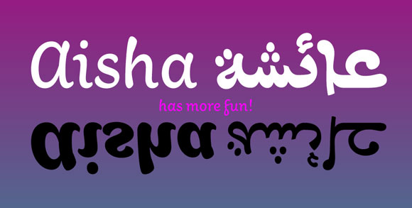
Our first release was an informal design for Latin and Arabic called Aisha. It was designed by Titus Nemeth and released in January.
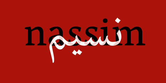
Later on, in June, Titus added his bestseller Nassim adapted for OpenType technology (it was previously released for Tasmeem technology by WinSoft). Not only did this typeface collect numerous awards, it also became very popular among Arabic designers for its… well … beauty and high quality of execution. For the same reasons BBC chose it for its redesigned news portal. Versions of Nassim tailored for specific language-needs and optimised for the web are now served on BBC Arabic, BBC Persian, and BBC Urdu to around 7 million unique visitors each month.
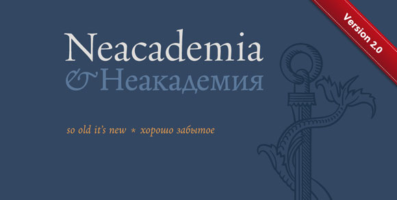
In June, the first two weights of the type-system Neacademia by Sergei Egorov were released. Neacademia is a remarkable revival of Aldine types – not only in the way it looks, but also in the way it operates, from contextual alternates used instead of kerning to smart, asymmetrical spacing of capitals. We are preparing its update which will include small-caps as well.
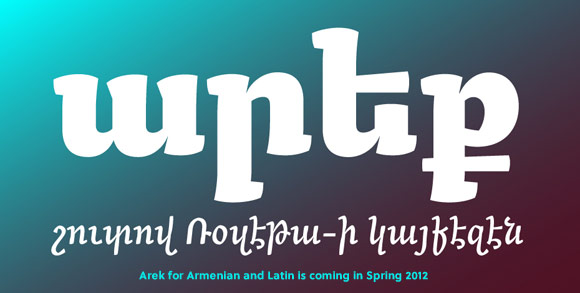
During the summer months, Khajag Apelian adapted his fresh Armenian type family Arek for use in the Yerevan Magazine. We are thankful to the designers of the magazine for providing this opportunity and also for their feedback. Arek will be released for Armenian and Latin this year. At the moment, its Armenian part is only available for beta testing and custom licensing.
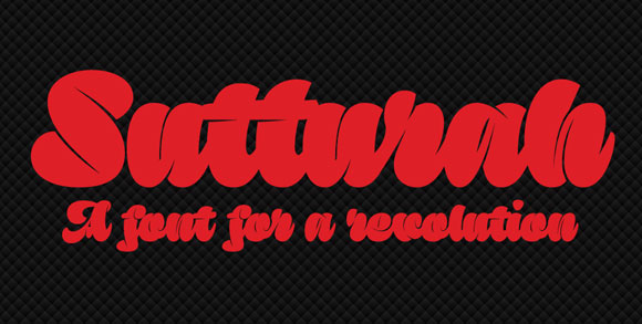
November has seen our most recent release, the striking fat script type Sutturah by Octavio Pardo. So far only Latin is available, but my hope is that, as I write, Octavio is finalising the design of the Cyrillic version, to be released soon.
Most recently, Skolar was updated to support various transliterations schemes (most importantly for Arabic, Chinese/Pinyin, Sanskrit, and contemporary Indian languages, but there are many more options) and it now includes the capital form of German ß.
We have signed up with two distributors (MyFonts and FontShop). Rosetta also made two language-specific sales which became quite popular, so one could expect them to happen again this year. Besides socialising through common channels (Twitter, Facebook), we have given several lectures about our work in UK, Iceland, USA, Poland, and the Czech Republic. Rosetta also became one of the sponsors of TypeTalks 2 conference (not to be mistaken with the recent TYPO talks which developed from TYPO Berlin).
Perhaps we should clarify why we always talk about multi-script typefaces. We do not like the term non-Latin: typographic systems should be designed to serve all writing systems, not just one, right? We like to use the term ‘world scripts’ instead. Yet, it is not all that we do. We not only design for individual world scripts, but for several at the same time! And we work hard to make them work together smoothly. It means that users do not need two different fonts and rescale them to look equal, risking the eventual appearance. It means that besides the weight, the styling is often very similar. It means that they do not run into encoding problems when they use words in the other script. It means that writing in multiple scripts is as easy as it gets. And while all these efforts seem too specific, they have been instantly understood by our customers.
What is next?
In 2012 we will finally start offering our webfonts via Fontdeck, and for self-hosting on custom basis. It is particularly important for Arabic web-typography which was so far bound to use ugly system fonts. Yes, you will be able to licence Nassim, and yes it works in most of the current browsers.
Rosetta will be presenting at Typography day in Mumbai (1–3 March) and in connection, we have decided to do a little “Indian tour” through Delhi, Agra, Jaipur, Ahmedabad, Mumbai, and Goa. Yes it is a tourist trip, but we also hope to visit a few studios and individual graphic designers in the region in order to promote our work and lecture about type design and typography in general. Let us know if you would like to meet.
TypeTogether will release more weights for one of the typefaces mentioned above. And we will add two new writing systems to our library, and at least one new Arabic plus Latin type family. Stay tuned!