Text typefaces are essential for serious typography. Yet there is an absence of such typefaces in most Indian scripts. And when it comes to typefaces that work well in multi-script environments, the scarcity is even more pronounced.
Skolar’s new complement aims to fill this gap for Devanagari – one of the major scripts of India. The foremost consideration was to create a design suited to Devanagari and its particularities, and not to uncritically borrow formal principles from one writing system to another. The objective was to create a versatile type family that would work smoothly for complex typographic purposes and yet remain distinctive and energetic in larger sizes.
The typeface was designed and engineered by two professional type designers, Vaibhav Singh and David Březina, both of whom have experience with designing for Indian writing systems. Importantly, they undertook substantial research in the historical developments and current situation of the Devanagari and Gujarati letterforms. Both have previously written dissertations on these subjects during their postgraduate studies.
The original brief for Skolar was adhered to, and the Devanagari complement also provides extensive support for scholarly and multi-lingual publications, covering a wide range of possibilities – complex Sanskrit can be set with it as readily as regional languages; contemporary mixed-language messages as harmoniously as academic treatises.
Skolar Devanagari also attempts to provide alternative solutions to the legacy of metal-type and its shortcomings. Limitations arising from the physical nature of metal-type made many compromised typographic practices prevalent. These are still carried on in digital fonts today although they are not relevant given the advanced OpenType capabilities. Skolar Devanagari presents a reevaluated attempt at a more well-considered solution with contextual substitutions and appropriate mark positioning.
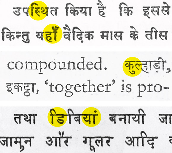
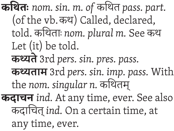
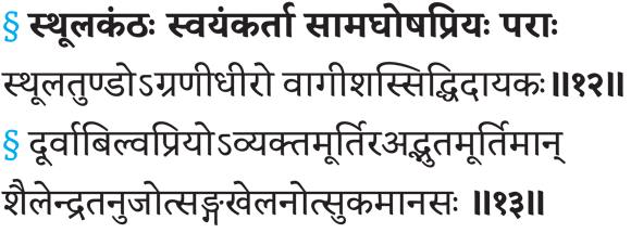
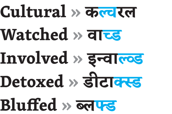
The typeface provides an extensive range of conjuncts and adopts a rational approach to letter-combinations. It covers almost all meaningful bi-consonantal conjuncts and frequent tri-consonantal and quadri-consonantal conjuncts with a view to provide for the unexpected or novel combinations often encountered in scholarly texts as well as in day-to-day transliterated words.
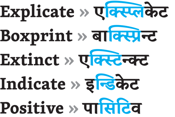
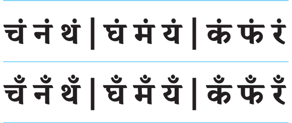
All in all, the typeface has been optimised for more than 1500 basic syllables, which are either precomposed or built from half forms. These basic syllables can be further modified by means of matras (aka vowel marks) and other marks (reph, rakar, anusvara, nukta, candrabindu, …). All of the meaningful combinations are designed and engineered to avoid ungainly collisions.
Production
The complex engineering work is an integral part of the design for most of the Indic scripts. Skolar Devanagari fonts were developed in the Adobe Font Development Kit for OpenType (AFDKO) instead of the more commonly used MS VOLT workflow. Skolar Devanagari is apparently the first Devanagari font built this way. Thanks to custom macros for syllabic analysis in FontLab and Glyphs the sheer amount of syllables and mark combinations could be tackled precisely. Using the new tools streamlined the whole process and allowed for rapid prototyping, systematic issue-tracking and prompt updates.
Acknowledgements
The authors would like to express their gratitude to Fiona Ross who taught both of them and commented on the design in the early stages, to Adobe Type team (namely Paul Hunt and Miguel Sousa) who provided impeccable support during the production in AFDKO, to Georg Seifert for help with some of the custom macros, and to Rosetta’s intern Ami Shah for careful testing of the beta fonts.