It has been ten years since we launched the first Rosetta website on 11 January 2011 at 11:11 CET and started making it our business selling fonts for multiple scripts of the world. This anniversary prompted a reminiscence of our past efforts, so here’s a personal look back at what those ten years brought to our corner of the industry.
(The motivation)
The market for digital fonts was quite different ten years ago and we did not have any certainty whether our new venture was going to pan out. We simply felt that more fonts for more scripts ought to be made, and that they should be made well.
Every Czech designer understands the need for high-quality diacritics in fonts. They know first-hand that many of the hip and renowned Western foundries do a poor job when it comes to accents, and that a strong brand is not a guarantee of quality across the full range of languages they claim to support. We extrapolated from this experience and committed to quality in every script we would tackle.
(The inspiration)
Obviously, we were not the first to focus on language and script support that goes beyond European languages. Besides vernacular foundries typically providing fonts for a single script, some were providing Cyrillic-Greek-Latin (LCG or pan-European or PE) or Chinese-Japanese-Korean (CJK) support.
While we could not compare to the big players like Adobe, Morisawa, or Monotype,* there were a few smaller foundries that diversified towards multiple scripts. Some of them became an inspiration and indication of what could be achieved. Russian Paratype had been offering fonts for languages and scripts of the former Soviet republics for some time. Then there was the rigorous Canadian duo Tiro Typeworks, with whom I collaborated on two projects before Rosetta. Slovak-Dutch Typotheque had already tapped into designing for Arabic, Cyrillic, and Greek and their Peter Biľak had just founded the new Indian Type Foundry together with Satya Rajpurohit. London-based Dalton Maag started speed-growing from a relatively small studio into a mid-sized company while developing custom multi-script projects for global clients such as Nokia, Intel, and others.
(The model)
There has been a lot of talent coming out of type design programmes in the past few years. Many of these designers have enthusiastically embraced working in various world scripts, including those unfamiliar to them when they started studying. I thought that a platform where such projects could be released without the pressures of vicious commercial deadlines would allow people to develop knowledge, expertise, and eventually confidence to design for scripts of their choosing rather than only those they were born into. At the same time, this could also help solve the apparent lack of quality fonts for typographically less-represented scripts by expanding relevant knowledge in the type design community. In turn, it would also benefit readers.
The business model was similar to other font publishers. Our collaborators would work on their own time and we would pay them shares from future sales of their fonts through our e-shop. And importantly, the designers would retain ownership of their designs. We would help manage the design progress – by providing art direction, quality control, production, post-production, legal support, marketing, library maintenance, promotion, and customer service – to free our collaborators to focus on design.
This plan turned into Rosetta.
Every now and then we hear how multilingual communication is a novel thing, or that multi-cultural societies are the new challenge. We chose the name Rosetta, in reference to the famous Rosetta Stone, to remind people that multi-script documents have been with us for millennia. We’re just helping the newcomer, digital typography, play catch up.
I did not want to do this alone, so I teamed up with Veronika Burian and José Scaglione of Type Together because of their experience running a successful independent type foundry. And although this collaboration lasted only two years, their initial wisdom and guidance were a great help in the early days.
(The ignorance)
Developing design knowledge about the visual system of a particular world script takes time. Familiarity or the ability to read the script give one only so much head start and by itself are not a guarantee of quality. We believe that with patience and commitment, one can learn to read or design for any script.
But how do we, as a foundry, guarantee quality in all the scripts we want to design for? We acknowledged our limits and worked with consultants such as Fiona Ross, Irene Vlachou, Maria Doreuli, or Meir Sadan (to name a few) in cases where the designer was less experienced in their project’s script. Beta testers and informal reviewers have been a great help too.
(The job of a designer)
Working on a retail typeface takes months. It means choosing the harder way over a steady paid job, possibly working late nights and weekends to squeeze the passion project around a daily job that pays the bills. Developing a multi-script typeface takes even more time. The challenges of one script multiply when they meet those of the other script. When designing for a previously unfamiliar script, one also faces uncertainties every step of the way.
Type designers face all of these challenges with unclear prospects in an unpredictable market driven by fashion. Every single designer who has released with us deserves applause here for their skills and for their commitment.
Sadly, for every two projects that get released, there is one that doesn’t make it. There are moments when a foundry has to cut ties on projects that stop moving ahead, whatever the reason. But there are also times when we have to acknowledge our own limits; every now and then, I still have mild coding nightmares about the Burmese medial forms.
(The start)
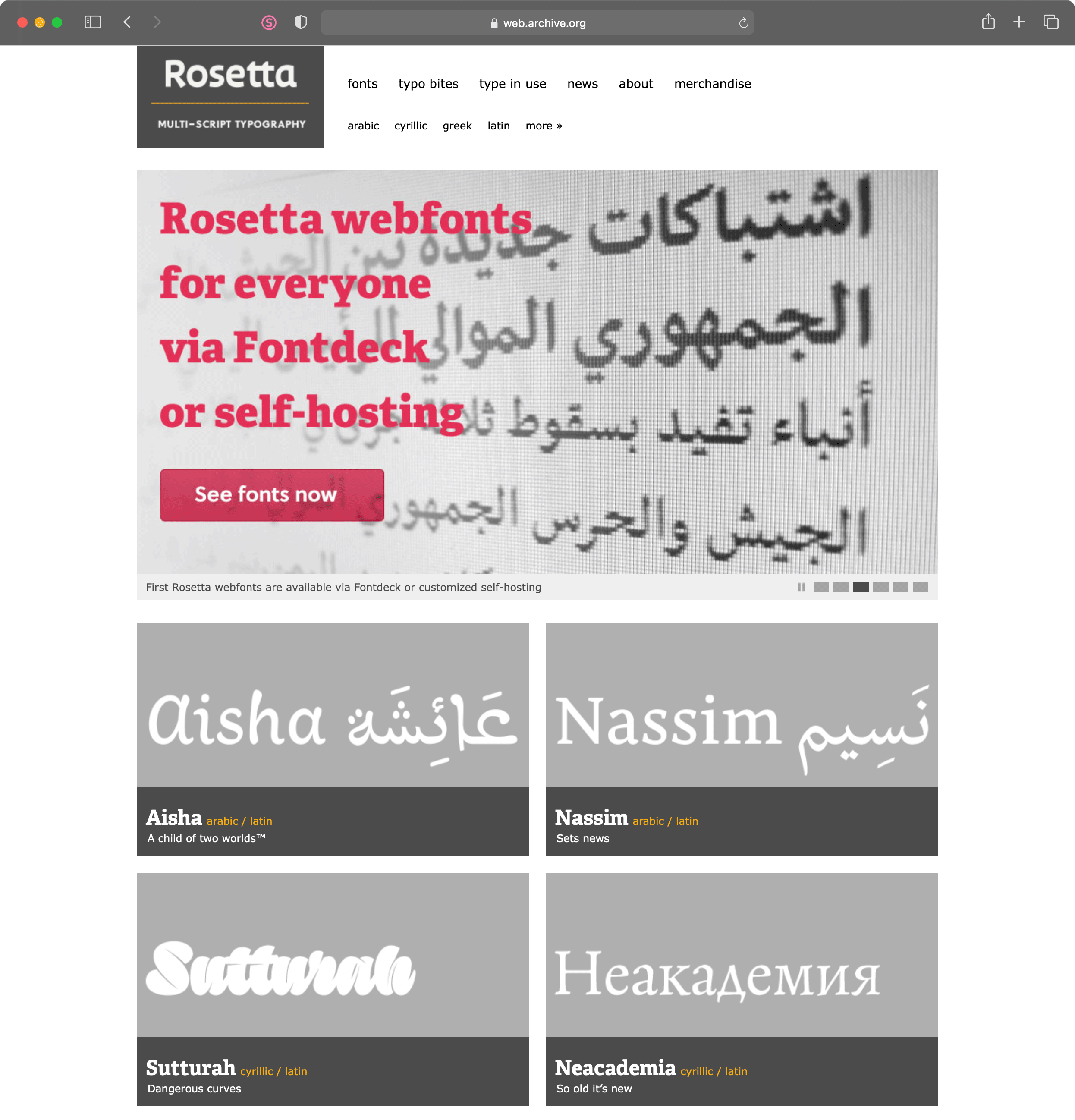
When we launched, there were two type families in our library: Skolar and Aisha. By the end of the year, there were five, and they were supporting five scripts. Each of these early releases tells a different story about multi-scriptuality.
I started Skolar during my MA at the University of Reading as a Latin-script typeface, but developed it anticipating stylistic requirements of other scripts, particularly Indian ones. In 2009, Skolar Latin was released with Type Together. By the time Rosetta published it in 2011, it supported Cyrillic and Greek, but the Indian scripts were to come year later.
In contrast to Skolar’s origin, Titus Nemeth’s Aisha started as a revival of a Maghrebi Arabic fount. The Latin was developed afterwards.
The next release was Nassim, also designed by Titus during his MA at Reading. It was also designed as Arabic first, and Latin second. Thanks to the BBC selecting it for their Arabic and Persian news services online, Nassim has been served to over 10 million readers monthly for the past ten years, and it helped improve the quality of Arabic web typography immensely. Note that when all this started, it was still the relatively early days of both webfonts and the BBC Online. We never counted, but Nassim must have been among the most used non-system webfonts at the time. Its illegal copies are now serving many users in Iran and they have been used by local news there to replicate the look of the BBC Persian website. Needless to say, we cannot easily/legally sell the fonts in Iran due to international embargoes, so Iranian users have had to get their hands on Nassim in other ways. It’s a good typeface, so can we really blame them?
Neacademia by Sergei Egorov ended up in our library by mere coincidence. I was asking Sergei, a graduate of the Moscow Institute of Physics and Technology living in the USA, for high-resolution images of one of his mathematical experiments with Aldine italics. With his response, he dropped me a line humbly offering his pet project. Released slowly over the years, Neacademia has become one of the most comprehensive revivals of the Aldine types: the Latin is the true revival, while the added Cyrillic comes from an alternative universe where Aldus Manutius printed in Russian.
The last release of 2011 was Sutturah by Octavio Pardo. It shows the challenges achieving equal illegibility across scripts. Awesomely intricate, admired by many, used by few. Some projects are released because you simply have to get them out there, not because they pay off.
Looking back, the first year looks like one crazy release frenzy. Eventually, we had to slow down and make tough decisions between pace, multitude, and quality. And although behind each project there’s a lot to talk about, there is no space to indulge in a lengthy discussion of each. Here is a table at least.
| Release date | Type family | Author(s) | Script(s) |
|---|---|---|---|
| 2011–2016 | Aisha Arabic | Titus Nemeth | Arabic |
| 2011–2016 | Aisha Latin | Titus Nemeth | Latin |
| 2011 | Skolar PE | David Březina | Cyrillic, Greek,, Latin |
| 2011 | Nassim Arabic | Titus Nemeth | Arabic |
| 2011 | Nassim Latin | Titus Nemeth | Latin |
| 2011–2016 | Neacademia | Sergei Egorov | Cyrillic, Latin |
| 2011 | Sutturah | Octavio Pardo | Cyrillic, Latin |
| 2012 | Skolar Devanagari | Vaibhav Singh | Devanagari |
| 2012 | Skolar Gujarati | David Březina | Gujarati |
| 2012 | Arek Armenian | Khajag Apelian | Armenian |
| 2012 | Arek Latin | Khajag Apelian | Latin |
| 2013 | Eskorte Arabic | Elena Scheider | Arabic |
| 2013 | Eskorte Latin | Elena Scheider | Latin |
| 2014–2016 | Skolar Sans PE | David Březina, Sláva Jevčinová, and Rafael Saraiva | Cyrillic, Greek, Latin |
| 2015 | Clone Rounded PE | Lasko Dzurovski | Cyrillic, Greek, Latin |
| 2016 | Gitan Latin | Florian Runge | Latin |
| 2016 | Skolar Sans Arabic | Titus Nemeth | Arabic |
| 2016 | Yrsa & Rasa | Anna Giedryś and David Březina (open-source) | Latin |
| 2016 | Eczar | Vaibhav Singh (open-source) | Devanagari, Latin |
| 2017 | Avory PE | Sláva Jevčinová | Cyrillic, Greek, Latin |
| 2017 | Corsair PE | Ksenya Samarskaya and associates | Cyrillic, Greek, Latin |
| 2018 | Marlik | Borna Izadpanah | Arabic |
| 2018–2020 | Handjet (open-source) | David Březina | Arabic, Armenian, Cyrillic, Greek, Hebrew, Latin |
| 2019 | Adapter PE | William Montrose, Sláva Jevčinová, David Březina | Cyrillic, Greek, Latin |
| 2019 | Adelphi PE | Nick Job | Cyrillic, Greek, Latin |
| 2019 | Adapter Hebrew | Sláva Jevčinová | Hebrew |
| 2020 | Adapter Arabic | Borna Izadpanah | Arabic |
| 2020 | Gridlite PE | David Březina | Cyrillic, Greek, Latin |
(The production)
The production job, i.e. making fonts actually work, has changed dramatically. Ten years ago, OpenType support for Indian and South-East Asian scripts was not mature in many applications. Adobe did not yet have any Indian fonts in their library, and their pre-Cloud Creative Suite came with less reliable support. The main font editor back then, FontLab 4, could only be tricked into supporting the right-to-left kerning required for Arabic. It was also unable to compile the more advanced OpenType feature code required for Indian scripts; one had to use other tools, such as MS VOLT or the latest Adobe Font Development Kit for OpenType (AFDKO), which had just introduced this option. We chose AFDKO and thanks to people like Miguel Sousa and Paul Hunt, both working for Adobe, we developed our first custom production tools. Finally, we could compile fonts for Arabic and Indian scripts on a Mac! It took months to figure things out.
The new font editors (Glyphs and Robofont) were just around the corner. Over time, they have picked up a few tricks and they now support and often automate the OpenType features required. And thanks to Google Fonts, many of those feature layouts are now open-sourced and widely available as examples to follow. Things are being documented way better, too.
However, the most significant change has been the development and adoption of HarfBuzz, an open-source rendering engine that supports a majority of the world scripts. Started by Behdad Esfahbod, HarfBuzz brought unprecedented script support to browsers and operating systems. The open-source world thus leapt ahead of proprietary solutions by Adobe and Microsoft. (The story of Apple’s solutions would take longer to unpack.)
All of this is to say that developing Arabic and Indian scripts in the past ten years has been exciting, but also difficult and ever-changing, and thankfully it is much easier now. The amount of support we needed to provide meant that it would not have been possible to start Rosetta in London or New York and maintain the same quality standards. The financial pressures would have been too high for a mostly retail-based venture. Luckily, living expenses in Czechia were low and allowed us the freedom of idealists.
(The grand total)
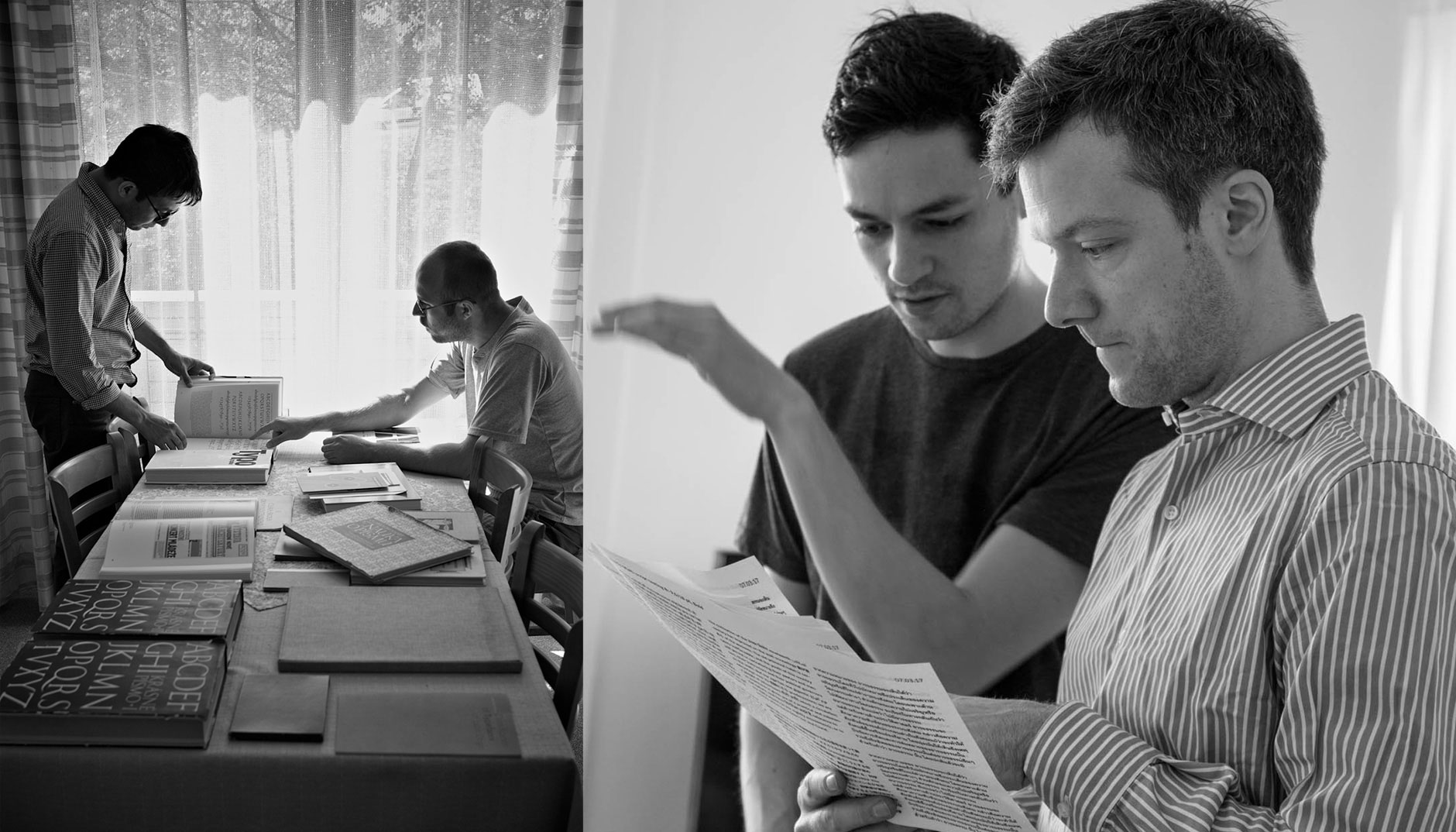
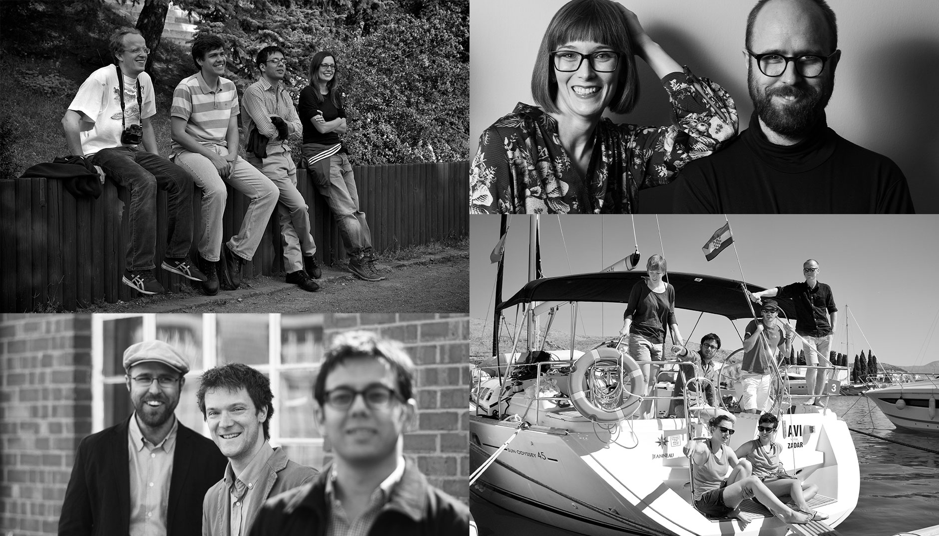
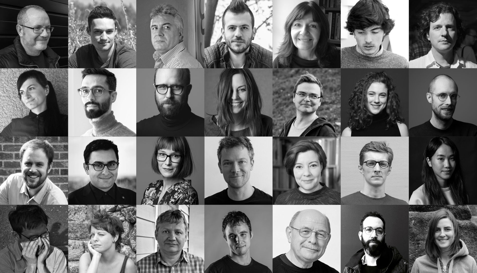
It is hard to say how many people work at Rosetta today. We do not function like a typical company for numerous reasons. At the core is me (management, type design) and Anna Giedryś (type design, marketing), with our part-time font engineer Johannes Neumeier. There are our frequent collaborators, often working on custom or in-house projects; the following worked on multiple projects with us in the past: Borna Izadpanah, Sláva Jevčinová, Ben Mitchell, William Montrose, Titus Nemeth, Florian Runge, and Vaibhav Singh. And there are further seven designers who released their fonts with us.
Since launching, we’ve worked with 40–50 esteemed colleagues including collaborating designers, consultants, studio managers, font engineers, interns, and others. Thank you all for helping Rosetta to make it this far!
Over the past ten years, we have released 28 type families supporting 8 scripts and over 440 languages in total. Three of the type families are open-sourced. And a few custom projects. Although the retail fonts differ in their degree of commercial success, nearly every release has been recognized by one or more design awards or featured in influential favourites lists. Not to mention all the love given by our amazing customers!
All these successes give only part of the picture, as we’ve also fallen short many times and in many ways. One shortcoming bothers me the most: we aimed to build knowledge, but we failed to share it. I was always “too busy”. Besides our open-source fonts, conference talks, and two TypeTalks conferences we organized, we only managed to publish a handful of blog posts about multi-script typography. In the past year, we have been working hard to change that. Last year, we managed to release the Universal Specimen which now allows everyone to test their own fonts in 333 languages of the world simultaneously. And we are almost ready to show you what else we’ve been working on. I can’t tell you what they are yet, but to build suspense I’ll leave you with a cliffhanger by sharing their names: Hyperglot and Design Regression.
In large part thanks to Johannes, we have also updated most of our library to include variable fonts and we will roll them out in the following months together with new PDF specimens. And if I find the time, there will also be limited-edition posters… and more fonts!
(The new competition)
Today in the type design community, in addition to those already mentioned, we have amazing competition in Mota Italic, Black Foundry, Ek Type, Fontpad, Typotheque Arabic, Typeland, Bold Monday, Commercial Type, and the up-and-coming Universal Thirst, each with their own take on designing for multiple scripts. And there’s also many other exciting foundries focused on individual scripts. All this activity is thrilling but also enough to give even experienced practitioners some degree of stage fright! But whenever I panic and question whether we still have something to contribute, I try to remember that more fonts for more scripts ought to be made, and I believe that this is a task best tackled by many.
—
* Note that Google Fonts and their open-source efforts were yet to come and change the game of scripts dramatically.
—
Edited by Andrea Churchill Wong.