In 2012 Jenny Stuttard, a Graphic Design student at Liverpool John Moores University, contacted David Březina with a few questions about how we create harmony between different writing systems, and how we determine its success. She also wanted to know to what extent Latin typography had influenced non-Latin type design.
— How different is designing a multi-script typeface compared to one that’s only designed to carry an individual writing system?
Indeed it is very different. There are several reasons why it is more difficult to design a multi-script typeface. First and most obviously, the more writing systems you are working on, the more drawings are to be done. Second, it’s very likely that some of those scripts are not as familiar to you as the others. That means you need to do research first, and pay extra attention along the way. Making the scripts work together is extra work. I usually say it is about 2.63× more work than a one-script typeface, but it can be even more, depending on the writing systems involved. Latin-Arabic typeface is certainly more complicated than Latin-Cyrillic.
Multi-script typography is about making strangers cohabit the same visual environment without any unpleasant incidents. It challenges us by juxtaposing scripts with visual characteristics, and cultural and historical contexts, that may be very different. Scripts that developed in different environments require different typographic solutions. If you are designing a multi-script type family from scratch, you can plan from the start for a solution that works for all the different scripts, a set of design parameters which when applied do not infringe on the readability of either of the scripts.
You can of course add a new script to an existing type family, but this can be more difficult: if you stick too much to the design parameters of the existing script, the new script can end up looking entirely unconventional or even unreadable. That means you may not be able to make it as closely related as you want. In that situation, in my opinion, it is better to aim for less stylistic harmony and better readability of each individual script and balance only the general typographic attributes such as weight or appearing height. Of course, there are different levels to that.
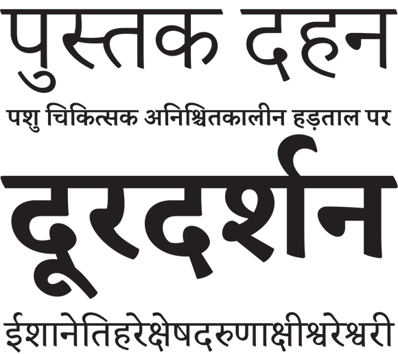
What about when adding a new script to a family, such as the Devanagari addition to Skolar. Was that a different type of process to the initial designing of the Latin, Greek and Cyrillic Skolar?
Skolar (Latin) was designed with Indian scripts in mind from the beginning. Therefore the method for designing Devanagari and Gujarati was quite similar to the Greek. The main difference was establishing the relative proportions between Latin and the Indian scripts. With Cyrillic and Greek this is already well established, but with Indian scripts there are no fixed conventions. Another thing is the stress or pen angle in most north Indian scripts has a different orientation than in Latin. This made designing them a bit more challenging since you need to switch to a slightly different mode while drawing. Furthermore, unlike European alphabets, Indic scripts need complex OpenType features for the fonts to display properly. And lastly, working on Devanagari was a collaboration with Vaibhav Singh; collaborating requires time to manage the division of work, maintaining efficient communication.
When bringing 2+ scripts together, should the focus be on trying to make them work together and matching them visually (within reason) or should the focus be on keeping them distinguishable and letting them function individually? How important do you think the idea of visual harmonisation is to bilingual and multi-script design?
There are different approaches and different answers to these questions depending on who you ask. And every new typeface is an attempt to answer the question within the constraints of a particular project. As I said, for me readability goes before harmonisation. Yet it very much depends on the intended use, the type of publication it would be used for. Naturally, the scripts should be distinguishable and sometimes you even want them to stand out. But that is perhaps the job of a typographer, not a type designer.
As there’s so much variation in different writing systems, both in the way they look and function, can we ever really make them ‘match’? Maybe it’s not so much about ‘matching’ but more about visually complementing, balancing, and making them work on an equal level.
I think you have just answered your question. ‘Matching’ is an odd word for me to use in this context because perhaps we are not trying to match the scripts, rather we are matching some design parameters. Balancing the importance of the scripts within one typographic environment is closer to my understanding of what multi-script typography is about.
What methods can we employ to balance scripts, and is it about creating some kind of harmony between them?
Separate what is essential to the script and what is just styling. That is best done by studying both current and historical materials, and a lot of them. There might not be a clear line, though. Recognise which design parameters (e.g. weight, size, contrast, stress, modulation) can be shared across the scripts involved and which are inherently tied to the script’s convention, and readability for that matter. You can utilise the shared characteristics to achieve a harmonious whole.
At the start of my research I was approaching it with the idea that I would be searching for this definite set of ‘golden rules’ to follow, when really maybe it doesn’t quite work like that. What I did find highlighted most often was to stay true to each script, and from there each situation is different and requires its own ‘rules’ for that brief. Would you agree with this?
Yes.
In your experiences have you found a set of rules that are generally applicable, or that you tend to come back to when working on a project?
- Assume as little as possible. Particularly, do not assume that if something works for one script, it will work for another.
- Intellectual humility is extremely important. Acknowledge not-knowing. At least to yourself.
- Be aware of influences technology could have had on a script.
- Get feedback. Pick your consultants carefully. Make sure you listen to people who have sound experience in type design and some kind of insight in the historical development of the script.
- Be sensitive and gentle. Do not overdo it with the harmonisation.
While completely morphing and stretching characters of one system to resemble another is never really going to look that good or function very well, how much room is there to play with the design when combining scripts? Perhaps these designs would belong more to experimental typography and not really within commercial design, but are there ever situations where borrowing quite heavily from one script is ok?
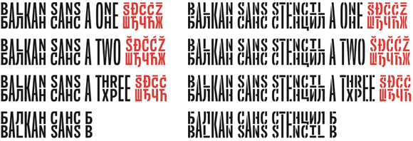
There is a great risk it would end up being a pastiche. If that is what you want, then yeah why not. And it could be an interesting concept. Balkan Sans by Nikola Djurek and Marija Juza is a good case study.
Do you think it’s fair to say a large number of non-Latin designs are coming into existence as counterparts for pre-existing Latin typefaces and in multi-script families as opposed to standalone designs for that script?
No, I do not think that is correct. There is a multitude of mono-script typefaces. Thorough research would be needed.
In fact, the whole idea of multi-script type design (balancing different scripts within one type family) is rather novel. Not the idea of multilingual communication of course.
Do you think there’s the chance that the growing number of situations that require multilingual design may lead to alterations of certain scripts?
It is hard to tell. There have been several kinds of alterations in the past. I’ve noticed some common patterns: a) the influence of technology: some technologies are friendlier to one script then to another, b) the ignorance of a designer: designers making uninformed or misinformed decisions, c) the arrogance of a designer: the belief that one has the right to alter the conventions of a script. The last one is particularly interesting. You see, convention (and readability of a script) is a result of a collective history. Under what circumstances does an individual have the right to alter it and to what extent? And where do you draw a line between experiments and imperatives?
Those would be mostly negative alterations, but there are maybe some good ones where, for example, options in one script inspire implementation of similar options in another script in order to provide a wider typographic repertoire.
Like languages, no writing system is an island and there will be influences among them for sure. The question is whether these alterations are done for the benefit of the reader.
Do you think it’s fair to say that if this was to happen, then it would more likely be the result of designers (inappropriately) making these alterations in an attempt to match differing scripts, rather than a necessary evolution of the script?
It would depend on the case, the designers and their motivations. Good designers are aware of the matchmaking issues and can deal with them sensitively.
There’s also the influence of technology conceived for a different script. It seems that most of the world scripts have their roots in handwriting and calligraphy. Any typographic technology is a means to speed-up production and reproduction. So far, each new technology has brought improvements in this respect, but it has also imposed limitations on some of the scripts. For example, metal typesetting, with its decomposition into separate metal pieces, is not ideal for Arabic, where joining is the essence of the script. The same applies to Devanagari. The subsequent technologies (photo typesetting, digital typography) brought many improvements and thus eliminated lots of the downsides, but some still remain. Many think that OpenType is the ultimate solution. Unfortunately, it too has some drawbacks. For example, Nastaliq (a particular style of Arabic) is still quite a challenge to reproduce in OpenType*. And there are more examples.
* I am not exactly sure how good WinSoft’s Tasmeem typesetting system holds up in this regard. My impression is that it is doing better since it was designed with Arabic script in mind.