There are many different calligraphic styles used for writing the Arabic script, styles that developed over the span of many years and in different regions. This article will explain the characteristics of the major styles and styles that were influential on future typographic developments, and give readers the ability to visually distinguish between them.
The basic Arabic alphabet consists of 28 letters, and because these letters are all consonants, the alphabet is classified as an abjad. Abjads represent consonants, or consonants plus some vowels. However, Arabic is an impure Abjad; the long vowels are represented in the alphabet by the letters alif, yā and wāw (ا - ی - و), and the short vowels only exist in the form of diacritic marks that are usually absent from texts, as context largely helps to avoid the drawback of misreading a word. Another important feature of the script is the lack of distinction between uppercase and lowercase letters. In both printed and written Arabic, words are constructed in a cursive style; this means that characters are written through the continuous movement of the pen, and dots are usually added in once a single word has been fully written. Additionally, the same letter can take on a different appearance, depending on where it appears in a given word. This is because in Arabic, letters have contextual forms, and can appear in initial, medial, final and isolated positions.
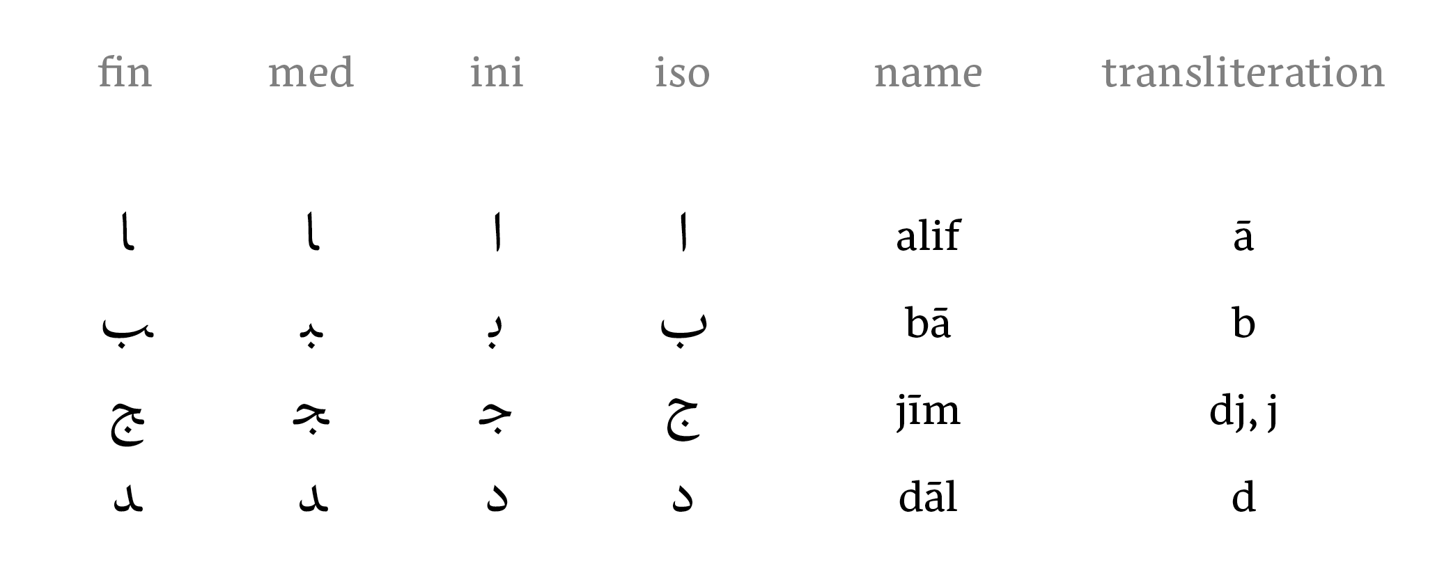
Other noteworthy features of the script include numerals being written from left to right despite words being written from right to left, the copious amount of dots used to characterize letters that share a basic form, and achieving justification by means of extending certain letters (this is referred to as a kashida).
Kufi
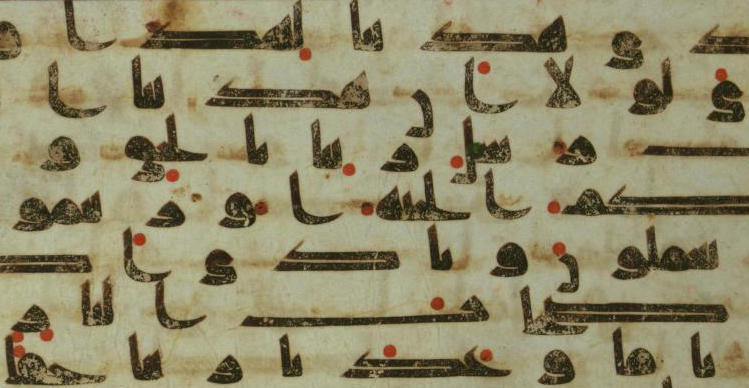
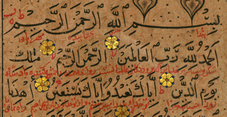
At first, localized variants of the Jazm script were used to record the Quran, and each of these scripts carried the name of the region they were created in – Makki from Mecca, Madani from Medina and Kufi, which ultimately became the general term used to describe this style, from Kufa 1. Features of Early Kufi include horizontal strokes that are either extremely elongated or very compact, the crescent shaped curve on the lower right side of the alif, and noticeably round characters that have extremely small counters. Towards the end of the seventh century, vowels were introduced into the text in the form of red dots placed above or below characters to show proper pronunciation 2.
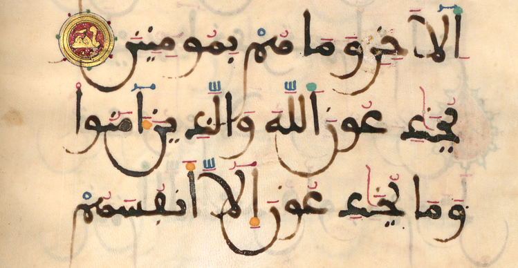
In the tenth century, Persian calligraphers developed a new variation of Kufi called Eastern Kufi 3. There are many noticeable similarities between this style and Early Kufi in the character shapes and geometric structure. However, when looking at Eastern Kufi and scripts such as Avestan and Pahlavi 4, distinct influences of the national scripts can be observed. The contrast between the long ascenders and shorter slanted strokes, curved letterforms, strokes that are more slender than in Early Kufi, and the tendency to employ a slight slanting to the left when writing, are some of these characteristics. These features give the style an overall highly vertical and upright appearance, and a dynamic forward movement when reading. Eastern Kufi was used to transcribe the Quran for some time before it was replaced with the Naskh style, but continued to be used for decorative purposes such as chapter headings.
Around the same time as Eastern Kufi was being developed, its Western counterpart called the Maghribi Kufi was evolving. Maghribi (which translates to western) originated from the Western Islamic world of North Africa and South Spain, and was highly influential on the future scripts of North and West Africa, as well as Andalusia. Characteristics of this style includes descending strokes that have large bowls, sweeping curves that encircle the next few letters, flat vowel signs that are often added in with red ink, and the general use of uniform strokes with a toothpaste quality.
By the twelfth century, these three styles of Kufi were slowly replaced as the main style for transcribing the Quran and book calligraphy. Instead, they were used for ornamentation on objects such as coins, seals, pottery and on monuments, and many of the newer Kufi styles began to emphasize visual aesthetics over legibility. Today this style is still widely used in design and for decorative purposes. It is also commonly referred to as the source of inspiration when describing very low-contrast typefaces that have become ubiquitous in recent years in attempts to harmonize Latin and Arabic. However, a comparison of these styles and Kufi calligraphy shows great dissimilarities in the letterforms and their proportions.
Naskh
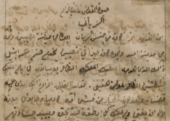
The Early Naskh style originated in the cities of Mecca and Medina around the seventh century. However, it was truly refined in the early tenth century through the endeavors of Ibn Muqlah 5, who transformed it into an elegant cursive script. Naskh quickly became the preferred calligraphic style for manuscripts and transcribing the Quran; a replacement that was doubtless due to features like high legibility and the fact that it is quick to write. To this day, it is the most commonly used style in the publication of the Quran.
The harmonious proportions of Naskh render it extremely legible. This combined with the way in which most characters rest on a visible connecting middle stroke has appointed it as the style most adaptable to the limitations presented by metal. Today, most newspapers, publications and periodicals are printed with typefaces based on Naskh, making it the most widely used style for setting text in Arabic.
Thuluth
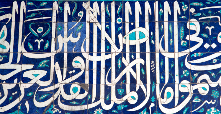
In Arabic, the word Thuluth translates to ‘one third’. There are different theories as to what this is referring to, such as the observation that one-third of each letter slopes, or that it relates to the pen size that is used to write this particular style. The most acceptable reason is most probably that of Ibn Muqlah himself, who has been quoted to say that in Thuluth, one-third of the letters are straight, and two-thirds, round 6. Thuluth is closely linked with religion and often finds its application in the decoration of mosques and writing holy names. Notable features of this style are the inclusion of vowel signs and ornamental frills that are used to beautify the script, and a combination of sharp, hair-thin out-strokes that curve slightly upward in a small loop. The letters are usually large but very compact, high ascenders are written with a slight tilt towards the left, and round shapes predominate the texture.
Ruq’ah
An invention of the Ottoman Empire Government offices in Istanbul, Ruq’ah was created by combining elements from two styles; Ta’liq and Dīwanī. Many similarities such as diagonal word structures and connecting strokes that were devised to increase the speed of writing can be seen between Ruq’ah and that of its parent styles. The main feature however, is the exclusion of elongations, decorations, or the need to lift the pen off paper. These attributes made Ruq’ah fast to write and efficient for the use of government scribes 7. Other characteristics include clipped letters composed of short, straight lines and simple curves, as well as its even lines of text. Another important and distinct feature is the connecting of the diacritical dots to the final and isolated letters in the form of short strokes.
Conclusion
These are only a few of the many calligraphic styles used to write the Arabic script, and while it is easy to detect the unique features of each, other styles are not so easily distinguishable. Sometimes it is only through details, like the size of the alif that styles visually differentiate. Today, calligraphy is mainly practiced as an art form, and even when looking at the most widely employed styles, there is a noticeable decline in use from the early 19th century, when printing technology appointed Naskh as the most adaptable variant. However, the importance of studying these various calligraphic styles is in the fact that some, (most notably Naskh, Maghribi, Ruq’ah and Kufi) were imitated in the typographic reproduction of the Arabic script, and the success of these types was dependent on how close they could get to replicating handwritten manuscripts. Calligraphic traditions like the relationship between stroke width and counter size, or the fitting of letters and words still remain relevant to the design of typefaces used in printing.
—
Footnotes & further reading:
1. Safadi, Yasin Hamid, Islamic calligraphy, 1979.
2. By the eighth century, these developed into the familiar short black diagonal strokes that are commonly used today. Baker, Colin F, Qur‘an manuscripts: Calligraphy, Illumination, Design, 2007.
3. Schimmel, Annemarie, Calligraphy and Islamic culture, 1984.
4. The scripts were used in Iran before the country adopted the Arabic script.
5. Abbott, Nabia, Studies in Arabic Literary Papyri, Vol. I, 1972.
6. Yūsofī, Gholam Hoseyn, “Calligraphy” Encyclopedia Iranica, Vol. IV, 1990. http:iranicaonline.org/articles/calligraphy (state as of 5. 3. 2016.)
7. Vilhjálmsson, Gunnar, “Ruq’ah – the new style” The Recorder, Issue 1, 2014.