For ages, designers have been extremely conservative in planning their type families. The biggest moves have been the introduction of the bold weight in the 19th century, Adrian Frutiger’s Univers as a precursor of Multiple-Master technology and interpolation techniques, mega-families encompassing multiple styles (e.g. serif, sans, slab), multi-script type families supporting vast amounts of languages, low-resolution fonts for screens, and whole type-systems effectively addressing issues in particular fields (e.g. newspaper design). Yet all of these, dare we say, utterly fail to cross the boundaries of the subject. They tend to focus only on type and solving typographic minutiae without maintaining wider context.
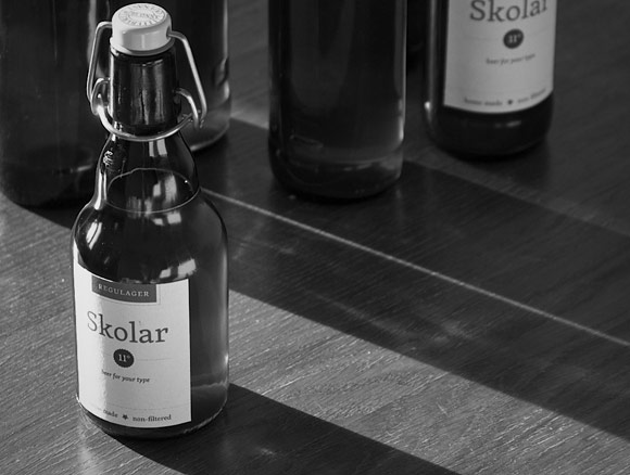
From the beginning, Skolar has been a type family that chose to cross boundaries – first of languages, then writing systems, and now it has been complemented, after Cyrillic, Greek, Devanagari, and Gujarati, with a beer! Providing typographers with an unprecedented tool fostering their expressive repertoire.
Challenges of harmonization
The key issue in “designing a complement” for an existing typeface is to figure out the fundamental principles defining the character of the said typeface and then translating these principles to a new environment. Be it new script or completely different craft, the principles are the same. Well, there is the unfortunate issue that drinks do not have as solid a form as letters. For that reason, a more innate connection between type and beer had to be found and implemented. One could call it an author-centred harmonisation approach. Crudely put, the idea is that the same mind will naturally come up with a related product.
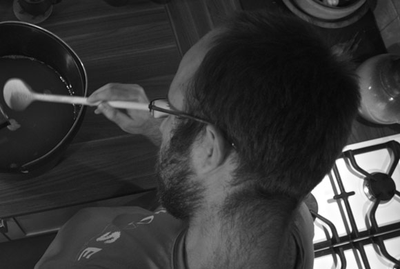
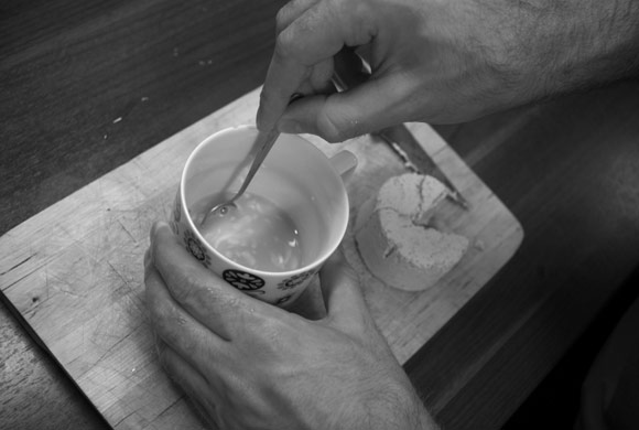
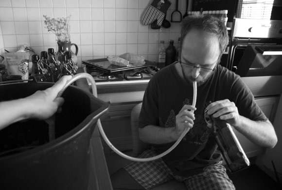
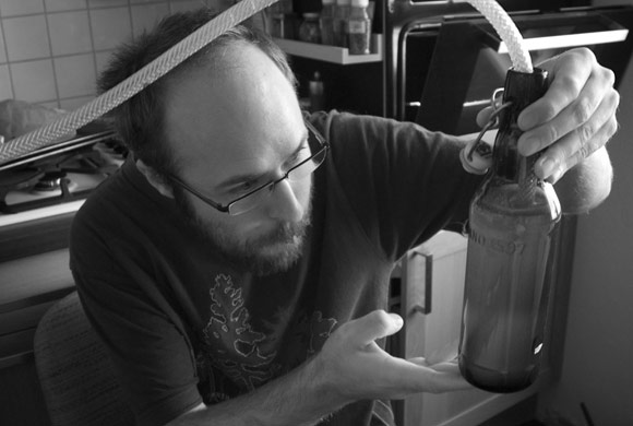
This complementary beer has been hand-made and lovingly supervised by the author himself. Moreover it has been home-made to allow the environment to seep in, the very same environment which shaped the author’s thoughts when designing the original typeface. The fermentation started at 21:15 on 3 September 2012 and ended at 08:57 on 10 September. Not surprisingly, and similar to the typeface design, it took ages! The beer is hop-less (no pun intended, seriously), the classic kind of beer and similar to the typeface it acquired a twist through the author’s intentions and admittedly some mis-intentions as well.

Proportions
Great care has been given to decisions on proportions. The goal was to make an 11-degree beer, i.e. beer with medium strength. However, after the initial tasting (and it goes without saying that no sugar has been added to increase the amount of alcohol in the beer) it seems more like a 12-degree beer. When perceived through the typographer’s optics, this is a clear parallel to the type which actually looks like a 12 point size when set in 11 points. It’s all in the proportions.
Is this just the beginning?
This non-filtered and 100% organic beer is just a prototype; an attempt to break off the generally stiff approach to type families. It is a semi-sweet, subtly-bitter beer with a yeast-y aftertaste and as it best fits with the Regular weight, we call it Skolar Regulager. Unfortunately for the readers, this to-be-merchandise was all entirely consumed during the Rosetta Camp. But there is hope.
Potentially, this is just the beginning of a larger mega-beer-family spanning from Light (pale beer) to Extrabold (dark beer) with non-alcoholic equivalents to the sans. In beer-brewing there is no concept of italics and we refuse to produce those kitschy perfumed beers and radlers (we are in serious beer business here!). However, here’s a thought: these could be ciders.