Today we have finally released our new website (its beta to be precise). It has been in the works for over a year and rather than a simple redesign it is a complete repositioning of the foundry. I discussed the basic reasons for this rethinking at the Smashing Conference in Freiburg last year, where I tried to define the challenges related to ‘type experience’. Admittedly a buzzword, type experience advocates a holistic approach to type. It deals with a) how typefaces are designed and engineered, b) how they are presented, c) how they are selected, purchased, and licenced, and d) how they are used. All these are surprisingly tightly intertwined and, in fact, we had to address most of them when working on the new website. Here is just a small selection of these considerations.
Presentation
The presentation of typefaces is tricky business. Type families are complex beasts which include many characters, features, and styles, yet their beauty and sophistication often lies in details. Should one present full character sets and list numerous styles or pick selected words? Highlight details or illustrate the texture at paragraph level? Explain all OpenType features or use simplified icons instead? Is there any significant difference between online and printed presentation today?
We had to address these questions and incorporate the thinking behind them in a unified web experience. On the one hand, conventional foundry sites (our old one included) present type by an extremely limited means of slides and carousels or stripes with font samples, but emphasise a strong foundry identity and a clear shopping environment. On the other hand, the recent boom of impressive micro-sites makes use of all the options the contemporary web has to offer in order to show typefaces at their best, to create equivalents of – or alternatives to – PDF or printed specimens. But in a way these sites become ephemeral, as ephemeral as fliers compared to books.
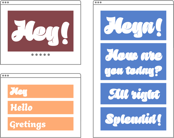
Our final solution is a hybrid of sorts – a set of micro-sites with similar structure and shared visual style. The introductory header sets the mood. Large specimens show the visual effect. Typeface descriptions, testimonials, and awards furnish the narrative for an expansive type experience. Style- and script-tables show the structure of the family. Highlights and OpenType features provide further insights for type geeks. The web performance section provides screenshots of our webfonts, so everyone can judge their looks on various platforms before making a purchase. And finally, we have incorporated detailed credits in order to appreciate the work of everyone involved in font production (it rarely ever is a singular person).
All samples are in vectors, so in theory, you could print the page and keep it for reference. In practice, they will look great on retina displays too. The web is responsive, so you can use it on you favourite gadgets too.

Shopping & licencing
Our clients usually buy fonts from a single family, thus we could simplify the shopping process dramatically by removing the process of registration (and remembering passwords!) and eradicating the shopping cart altogether. Thanks to that, we do not collect more data than absolutely necessary. We keep track of the purchased fonts though, in order to provide you with free updates automatically*. In fact, the whole website is built around this idea.
Furthermore, we got rid of PayPal with their dubious business practices and impossible support (more on that on Elliot Jay Stocks’s blog). As a bonus, all prices are now excluding VAT – more friendly to our overseas customers!
The biggest change by far is the introduction of our new compartmentalised licencing system. Instead of having the customers face a multitude of options and parameters – such as number of computers, page views, font formats etc. – we have decided to provide set options for freelancers, studios, publishers, and web designers. And for those who require more, or different configurations, we provide custom licences and a more personal approach. We also provide cheap, time-limited test licence for all our fonts. The licence agreement is (for the most part) written in plain language with each licence type clearly defined by what can and what cannot be done with the fonts.
* We plan to enrol all existing customers in this service.
Experience
In order to do all of this, we had to come up with a new production environment for the fonts and webfonts. As I already mentioned in another article, we reworked our font library completely to make sure everything clicks.
It would be tiring to enumerate all the changes and decisions we have made – and I sense I have already gone too far – just give the website a couple of minutes and explore on your own (and please do let us know if you notice any problems). But specifically, you should not miss the Fonts-in-use and Merchandise pages. I had absolutely no idea they would look so great when we put them together!
And there is more to come. We should have an online tester incorporated in the near future, and provide PDFs with character sets for every weight. This is just a first step, really.
We hope you will enjoy the new Rosetta and find the changes, some of which are unprecedented among type foundries, useful. It is often said that the type design industry is rather stiff and conservative. We tried to change that.
We owe much to Proof & Reason web agency and their team which worked really hard to make all of this possible. The design was done in collaboration with an external designer, the talented Jakub Sodomka based on the concept by me and Anna Giedryś. All photos and illustrations are by Anna Giedryś. The online specimens (Preview section of the family pages) were designed by Florian Runge. All texts have been carefully (and patiently!) edited by Vaibhav Singh. And our gratitude extends to everyone else who helped along the way, namely our type designers who beta-tested the site thoroughly.