This paper was originally presented as “Challenges in multilingual type design” at the ATypI conference in Amsterdam 2013 and it is a continuation of an article with the same title published in Codex magazine no. 2. The English and some arguments were kindly edited by Vaibhav Singh.
Type design is a discipline that adapts writing systems to typographic technologies. Therefore, its objectives are not only the re-styling of existing forms, but also the optimization of these forms for output and their use in visual communication. This essay will discuss several case studies in different writing systems (scripts, a shorter term, is used hereafter to signify the same). The point is to illustrate the current challenges connected with typographic improvements in scripts. These improvements have tended to fall in two broad categories: first, adapting the script to a new situation presented by technology, and second, the expansion of its linguistic and expressive repertoire. Yet there is an important meta-consideration. Multi-script typography challenges us by juxtaposing scripts with different visual characters, and cultural and historical contexts. Scripts that have developed in different environments require different typographic solutions. The thesis put forward here is that it takes a very different mindset to become a multi-script designer – a mindset which allows sufficient considerations for – and understanding of – the challenges mentioned.
Note that several of the case studies presented here include projects I have been personally involved in. This is not in any way to imply the solutions they present are the only correct ones. They simply allow me to speak about them with greater insight than if I were to comment on someone else’s work.
Knowledge acquirement and critical discourse
One should be aware of several aspects which influence our understanding of writing systems. First, it is a matter of acquiring and constructing a knowledge base. Some scripts are very well documented (Latin, Cyrillic, and to some extent Greek) in their local languages as well as internationally. But often typographically underserved scripts – that is scripts with a minimal availability of quality typefaces – have fairly limited publicly accessible sources of knowledge and, consequently, an underdeveloped critical discourse about typographic matters. This raises the question: how do we inform our decisions when engaging with these scripts as type designers or typographers? How do we find the relevant material and how do we evaluate it?
Reading is a process when we use eyes for hearing.
— David Abram on the effect of synaesthesia, The Spell of the Sensuous 1
In such situations it is also very difficult to find relevant consultants – people who are informed and typographically well versed in a particular script, and only secondarily, fluent in corresponding languages. This is, in my opinion, best explained by loosely quoting David Abram on the effect of synaesthesia: reading is a process when we use eyes for hearing 1. That is something completely different from designing, which is when we use our eyes for seeing. The reading experience cannot substitute the design experience. Picking a consultant should be an extremely cautious process similar to choosing working tools. Experience and expertise should be decisive factors, not an orientalist bias or visibility and frequency of online posts.
Another consideration when it comes to consultancy is how much one can rely on it. Consultancy could be a complete solution during the process of design of a script semi-familiar to the designer (such as Cyrillic for Latin designers), but the more unfamiliar and complex the script happens to be, the more preliminary research and understanding is needed. Otherwise, there is a danger of creating a pastiche or erroneous and inappropriate interpretation of a script even with the help of a consultant.
“To some extent, we deliberately [went with a contemporary design for Pure] because we feel that – and this sounds very imperialistic now,” he says with a small laugh, aware of the difficult territory he’s entering, “it’s time that some of these cultures were dragged screaming and kicking into the 21st century.”
— Bruno Maag on creating Nokia’s Pure, Digital Arts 2
Another issue connected with knowledge acquirement is the effect of misleading marketing and nationalistic propaganda. Marketing, which often overstates facts by means of simplistic superlatives or biased claims, can end up becoming a point of reference when reliable information or critical discourse is missing. Furthermore, international agencies often assume and perpetuate the occidental bias, i.e. ascribing little value to local tradition or practice.
“I fail to understand why type design is still considered ‘white man’s burden’: to uplift and civilise others. Even when there are capable people in those languages, the decision makers prefer people who do not speak, write, read or understand the language to those who do. […] Type colonialism?”
— Hashim Padiyath Mohemmadali comment on Typophile 3
Nationalists, on the other hand, often make sweeping statements against anything that comes from abroad. This seems to be a common trend in countries which have suffered from the imperialistic domination of other countries in the past. Sadly, this political concern is often used by vernacular producers to achieve their business goals, but on the other hand, severe anti-nationalism can obscure clear and objective views on any issue. Filtering bias from relevant opinion can become a daunting – but necessary – task in such environments.
With these points in mind we can discuss several case studies that provide examples of various design-related, technical, as well as intellectual challenges.
Extending the typographic repertoire
Typographic translations of documents from one writing system to another, or more precisely from one language to another, may constitute a challenge when the text relies on the use of styles natural to one script, but not to another. To name a few: all-cap setting or small caps are not transferable to unicameral scripts, and italics may be hard to represent in scripts which are naturally oblique. Introducing such ‘missing’ styles may help to solve some of the translation issues and extend stylistic repertoires of vernacular typography, but the validity and appropriateness of these styles in different scripts raises many more questions.

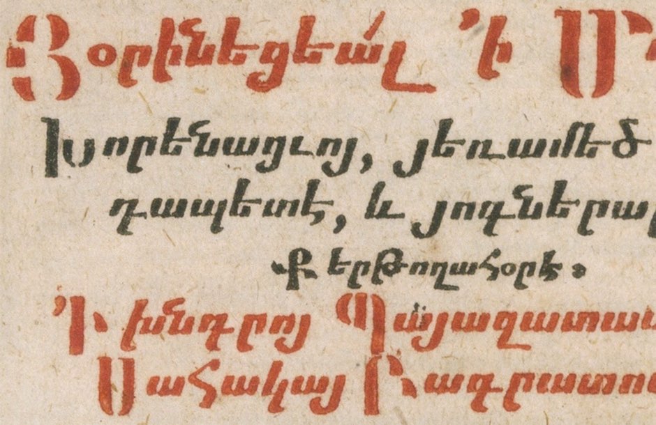
To name a specific case, Armenian script is very often written (even in the typographic environment) at an angle and the slant of the letters does not bear much significance for its readers. Therefore, if one were to design a complementary style with a role similar to italics in Latin, the slanted or oblique styles would not perform very well.


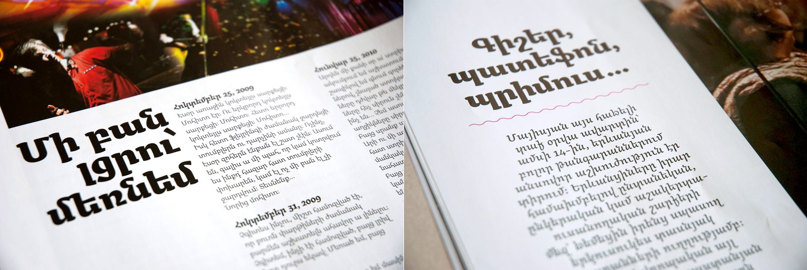
The type family Arek 5 designed by Khajag Apelian is the first type system that incorporates upright as well as cursive styles of the script in one typographically coherent whole. This is not to say that this type family has an invented italic or that it is the first digitized italic. It certainly is not. But it is a well-considered type family that includes a complementary style that is balanced with the main style in terms of proportions and typographic color. Apelian used Gerrit Noordzij’s definition of cursive writing as an uninterrupted (returning) construction in order to create a mental concept for the whole family while supporting this concept with research on historical manuscripts containing examples of both formal and informal writing.
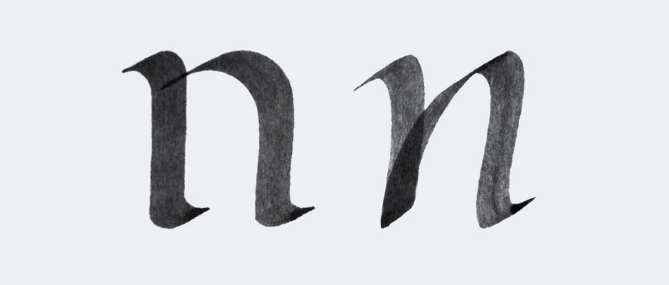
Thanks to its different construction, the cursive creates a different rhythm and texture‚ which is what is desired. The illustrations show that this additional style is not used for in-sentence emphasis. Instead, it is used to create aesthetic effects in headlines and pull quotes.
For other scripts, such as Arabic for example, the difference between formal and informal (or fast) writing might not be so apparent and thus creating an italic becomes more of a challenge. And eventually, validity of radical script borrowings is yet another matter.
Technological challenges
New type technologies not only bring advancements, they also bring constrains. Historically these have been physical constraints, as in metal type, currently these are constraints of font formats and encodings. Each writing system has to respond to the requirements of the technologies. For some, this is straightforward, for others it is a challenging task. This may relate to the simple fact that a certain technology was not developed with considerations for a particular script in the first place, but it may also be due to the complexity of the said script. This is a known and much-discussed issue in Arabic script, but it relates even to the way the diacritical marks in Latin, for instance, are treated and encoded by Unicode.


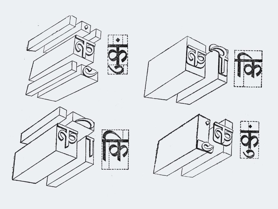
For Indic scripts, this has been an issue from the very beginning of their typographic use and several systems have been adopted, historically, to achieve acceptable results. Each system had to deal with a basic problem natural to the syllabic script: how to represent thousands of syllables with as small a glyph set as possible. Unlike Chinese, Japanese, and Korean (also CJK) writing systems, the Indian scripts took the path of phonetic decomposition following the logic of their script grammar. Sub-syllabic elements, such as half forms, were introduced to the glyph set and compound syllables and sometimes even basic consonants have been composed with them. In addition, syllabic and mark clusters have been introduced to resolve more complex shapes and collisions.


Today, although some of the scripts are already using standards such as OpenType and Unicode, their adaptations to the technologies remain somewhat underdeveloped and often mimic solutions devised for older technologies. For example, many Indic fonts developed around the turn of the last century have included enormous character sets to cover all possible and sometimes even impossible combinations of syllables and marks. Thanks to OpenType and its automatic mark placement this is not necessary anymore.
A case in point is the bindu and candrabindu mark positioning in Devanagari. These marks should ideally be optically centered above some characters and right aligned above others, following long-established scribal and day-to-day writing practices. In metal composition this was difficult to achieve thus most of the marks were right aligned above the last vertical stem. With the introduction of OpenType Devanagari layout, i.e. the standard way to program OpenType features to make the complex script work on computers, it became possible to reintroduce this positioning to contemporary fonts, most of which, however, continue to follow the legacy of older models, complete with their limitations and unquestioned process-decisions. This was brought to my notice by Vaibhav Singh during our collaboration on Skolar Devanagari 9 and we questioned and researched many design-decisions in the typographical adaptation of Devanagari before implementing them.


Another case – the Gujarati script does not feature a headline like Devanagari, but features the so-called foot (also known as flick or vanaak). This feature causes some vowel marks, which would join easily in Devanagari, to require a special treatment in Gujarati. Namely, the mark for vocalic R (also called rukar) which can theoretically attach to any syllable. In writing, the foot should not be present when the vowel mark attaches to the character. (Note: positioning of vocalic R does not constitute a major problem on rounded characters.) In contemporary fonts this is often disregarded as it would seemingly require having all characters with two versions of the foot, with and without the vocalic R (see Gujarati MT by Monotype). Another solution, Saguna Gujarati 10 released by the Indian Type Foundry 11 and designed by Jonny Pinhorn, features a complete removal of the foot. It places the mark below the stem disconnected even though the removed foot would allow for perfect connection to the stem.
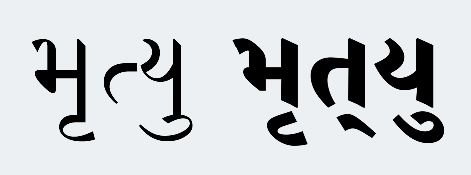
When the correct shaping of vocalic R was clarified to me by Ami Shah and Kalapi Gajjar, a different solution was implemented in Skolar Gujarati 12 and recently in Adobe Gujarati. When the vocalic R is attached to a syllable, the syllable is decomposed to half form and vertical stem in order to allow simpler alteration of the stem to take the mark. This very simple procedure creates the correct shape, but requires the creation of a half form for every character with a vertical stem. Nevertheless, this is not a problem since most of these half forms need to be designed anyway as they are used for building compound syllables.


This solution is a rethinking of existing models which builds on the fact that the basic building units in Indian syllabic writing systems are not the consonants, but sub-syllabic elements, such as the half forms. Notably, none of these solutions would be possible without a more comprehensive understanding of the writing system as well as the possibilities of new technologies.
Issues of harmonization
When designing a multi-script type family, one of the main considerations is the harmonisation of the writing systems. What does that exactly entail? The goal should be to provide equal means of conveying textual information, on the level of content as well as style. Usually, the intention is that the scripts within one type system should appear equally important on the page 13 which implies balancing basic parameters such as visual height and overall weight. Furthermore, a sense of stylistic equality is often expected. But what does that exactly entail? One might assume that similar design features, such as contrast, modulation, or terminals, would lead to a perfect harmony. Not necessarily. The shapes might look allied, but the message they convey may be very different in each script. Or in other words form connotations are not always culturally transferable. For example serifs are a design concept inherent only to certain scripts and in others they create a grotesque appearance. Does the notion of modernity contained in Helvetica transfer to Helvetica Arabic if we directly transfer the style or does it tell a slightly different story?
This leads to yet another contrast between marketing and good design because it becomes questionable whether large type families with very consistent styling are actually consistent in terms of the message they send and also in terms of quality. One should not automatically assume that non-Latin members of an excellent Latin type family are equally excellent or fit for the same job.
The following case studies illustrate some specific considerations.
When designing a Gujarati complement to a Latin sans type family one can face an interesting example of an uncritical terminology-loan. The foot inherent to most Gujarati characters is often misinterpreted as a serif although it has different origins, shapes, and conventions. Thus it may seem pertinent to design such a complement to the Latin sans without the foot. That is, to design a ‘Gujarati sans’. But unlike the serif, the foot is not a stylistic element and while it can be omitted at times, it plays its vital role in text typefaces. Thus such a complementary Gujarati design may look different for text typefaces and display typefaces. Furthermore, a general point can be made for the use of transferable attributes such as ‘modulation’, ‘low contrast’, or ‘text typeface’ instead of using script-centric terms such as ‘serif’ or ‘ascender’, for example.


Another case is the use of visual compensations. North Indian scripts, such as Gujarati or Devanagari, feature a reversed contrast compared to Latin thus creating a new visual context to visual compensations common in type design. This effect is present even in monolinear designs. In Latin when two strokes meet or cross, the area is visually corrected not to look too dark. This is done by thinning the strokes. Let’s compare Latin letter ‘q’ and Devanagari syllable ‘ya’ which may show some similarities on the skeletal level and in the treatment of bowls. In ‘ya’ the stroke joining the vertical stem should be only modestly compensated compared to the corresponding part in the Latin ‘q’. If the Latin correction measure is transferred directly, the Devanagari character will have an unbalanced stress distribution. The general point here may be that even compensation techniques should be reevaluated when different contexts are recognized.


During the design of Adobe Gujarati we have created a design concept which transferred the Adobe Devanagari stylistics to Gujarati, where possible. However, it was pointed out by Fiona Ross that the stroke reversals (or flaring terminals) present in Adobe Devanagari, while common in Devanagari script, look unusual in Gujarati. These stroke reversals have been introduced to the design in order to bring more weight to the terminals and to counter the staccato-like effects of straight verticals and horizontals in earlier types and many existing fonts 14. Although we thought that the theoretical concept we had would possibly work and provide greater stylistic consistency among the families, we also had to admit that the Gujarati with a similar treatment would look strange. As a matter of fact, my research did show a few Gujarati typefaces with such a treatment but it was always in the context of a decorative type, a very different genre than what we were aiming for. The goal was to design a text typeface with a similar level of conventionality and thus we had to use slightly different styling to achieve that. The theoretical, highly consistent model derived from abstract type design concepts was overruled by a model derived from a cultural consensus. In the end Gujarati is not just Devanagari without the headline, it possess different letterforms, but also a different calligraphic tradition.


Conclusion
Alice laughed. “There’s no use trying [...] one can’t believe impossible things.”
“I daresay you haven’t had much practice,“ said the Queen. “When I was your age, I always did it for half-an-hour a day. Why, sometimes I’ve believed as many as six impossible things before breakfast.”
— Lewis Caroll, Through the Looking-Glass, and What Alice Found There 15
At the great risk of sounding overly preachy, this conclusion is an attempt to propose the attitude multi-script designers (that is type designers, typographers, as well as graphic designers) should try to put in practise.
- Intellectual humility is extremely important. Practise it in order to open space for further development. Acknowledge not-knowing and mistakes. At least to yourself. It is alright to completely suspend judgment on matters one does not completely understand.
- Be aware of the influences technology could have had on a script historically and influences it may have on it today. There may be possibilities to rethink compromises of the past.
- Get feedback and pick your consultants carefully. Make sure you listen to people who have sound experience with type design and a fair insight into the historical development of the script.
- Sensitivity to cultures and contexts is a prerequisite for good multi-script designers. Do not overdo it with harmonization. Particularly, one should never take for granted that what works in one script will be applicable and equally effective in another.
- Try to imagine the impossible at least twice a day. It is a way to look beyond our own almost hardwired preconceptions and assumptions.
—
Footnotes
1. David Abram, The Spell of the Sensuous: Perception and Language in a More-Than-Human World, Vintage, 1997.
2. Neil Bennett, “Interview: Dalton Maag’s Bruno Maag on creating Nokia's Pure – a typeface for the whole world” in Digital Arts, 25 April 2012. http://www.digitalartsonline.co.uk/news/typography/interview-dalton-maags-bruno-maag-on-creating-nokias-pure-typeface-for-whole-world/ (state as of 5. 12. 2013).
3. Hashim Padiyath Mohemmadali’s comment in a discussion thread “Nirmala Malayalam, another mindless type design” at Typophile. http://typophile.com/node/105005 (state as of 18. 11. 2013).
4. Movses Khorenatsi, Patmutiun Hayots, Amsterdam, 1695. From: Lane, John A. The diaspora of Armenian printing, 2012.
5. Arek by Khajag Apelian, published by Rosetta Type Foundry in 2012. /Arek (state as of 5. 12. 2013).
5. Gerrit Noordzij, The Stroke: Theory of Writing, Hyphen Press, 2006.
7. Yerevan magazine, Yerevan, 2011.
8. The illustration is from: Naik BS. Typography of Devanagari. Bombay: Government printing and stationery, 1971.
9. Skolar Devanagari by Vaibhav Singh and David Březina, published by Rosetta Type Foundry in 2012. /Skolar%20Devanagari (state as of 5. 12. 2013).
10. Saguna Gujarati by Jonny Pinhorn, published by Indian Type Foundry in 2012. http://www.indiantypefoundry.com/fonts/indian-type-foundry/saguna-gujarati/ (state as of 5. 12. 2013).
11. Not to be confused with unrelated India Type Foundry established in 1932 in Ahmedabad, India.
12. Skolar Gujarati by David Březina, published by Rosetta Type Foundry in 2012. /Skolar (state as of 15. 2. 2015).
13. Please note: that the roles in typographic environment may be different than the defaults aimed at in a type family with more scripts. For example one script should look more important than the other for the sake of better distinction (if the scripts are too similar) or navigation (e.g. in vocabularies).
14. Adobe Devanagari type family description, Adobe.com. http://store1.adobe.com/cfusion/store/html/index.cfm?store=OLS-US&event=displayFontPackage&code=1940 (state as of 18. 11. 2013).
15. Lewis Caroll, Through the Looking-Glass, and What Alice Found There, Macmillan, 1871. As quoted in Alan Macfarlane, Japan Through the Looking Glass, Profile Books, 2009.